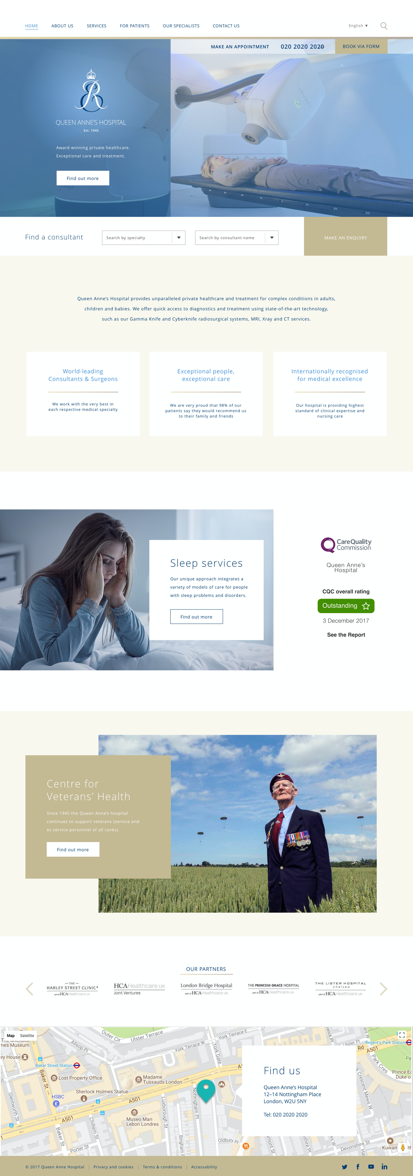
Queen Anne's Hospital – concept
Queen Anne's Hospital – concept
Queen Anne's Hospital – concept
Web design / User Experience
Overview
This is a personal project – a design concept of a home page for a hospital. I focused on the structure, user experience, look & feel , and commercial aspect in order to support company objectives and to convert potential visitors into leads for the hospital.
This is a personal project – a design concept of a home page for a hospital. I focused on the structure, user experience, look & feel , and commercial aspect in order to support company objectives and to convert potential visitors into leads for the hospital.
Details
The main design objectives included: conveying three key messages: high quality, personalized nursing care, hand-picked consultants; attracting a wider, younger demographic; switching the overall focus of the website away from an information-heavy site to a commercially focused, conversion-based website.
The main design objectives included: conveying three key messages: high quality, personalized nursing care, hand-picked consultants; attracting a wider, younger demographic; switching the overall focus of the website away from an information-heavy site to a commercially focused, conversion-based website.
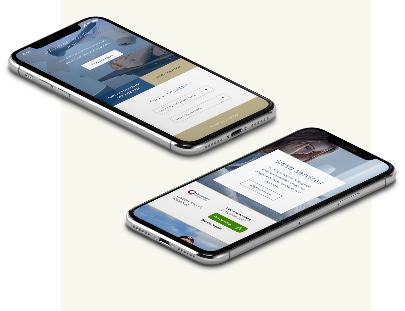
Responsive design
Responsive design
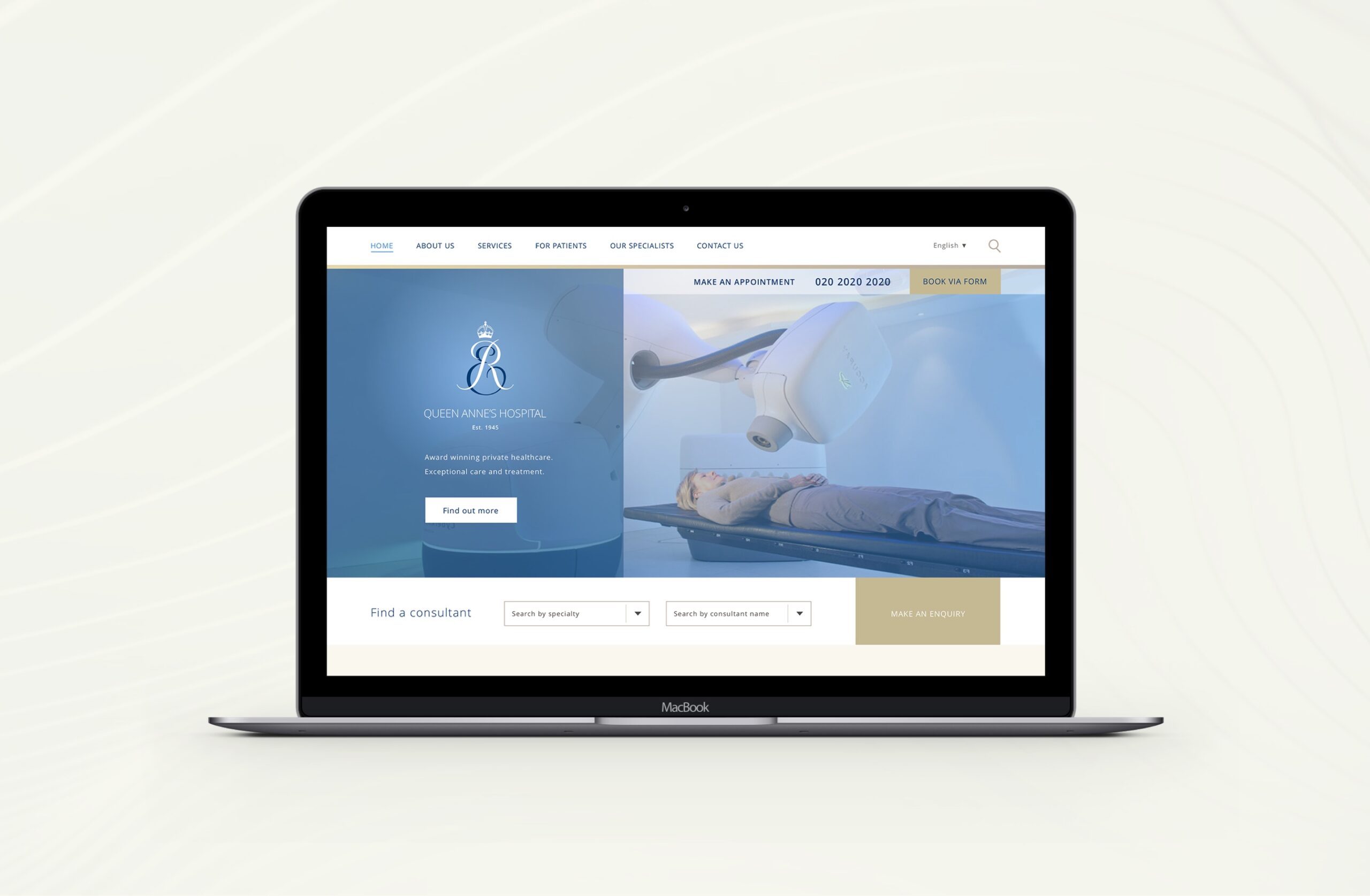
Home page – design concept.
I went with an airy and minimalistic layout, created clear CTAs, carefully chose imagery and color scheme – in order to reduce fear and anxiety among users.
Home page – design concept.
I went with an airy and minimalistic layout, created clear CTAs, carefully chose imagery and color scheme – in order to reduce fear and anxiety among users.
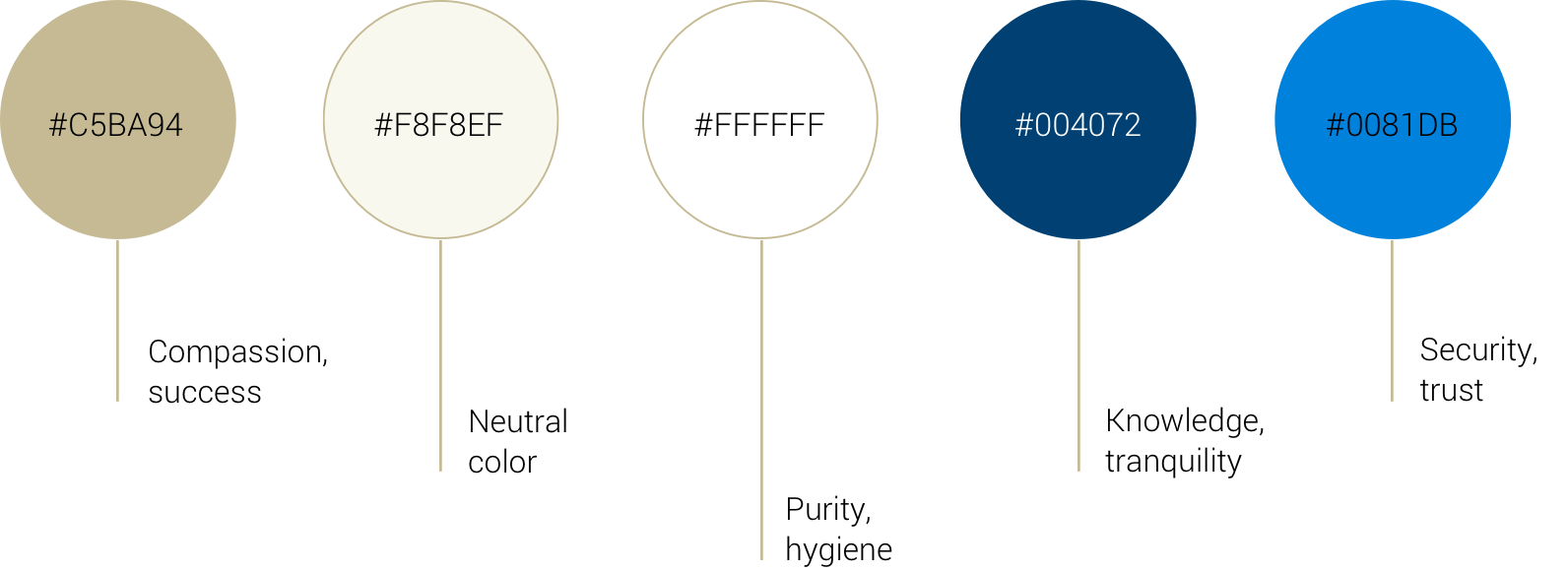
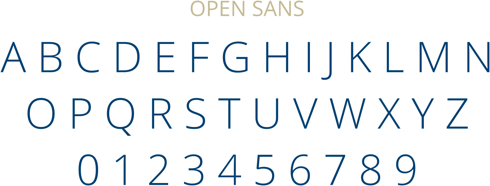
Typography & Color
Typography & Color
The chosen color palette for the website is based on the colors taken from the logo. Cool colors are balanced with the warmness of golden and beige. This palette helps to achieve a sense of tranquility. Open Sans is known for its excellent legibility characteristics, especially beneficial in web and mobile interfaces. It conveys clarity, modernity, and a friendly feel.