Innocent Drinks – concept
Innocent Drinks – concept
Innocent Drinks – concept
Web design / UX
Overview
Innocent Drinks is a modern, healthy brand, made with quality products and committed to the environment. Inspired by their positivity and vibrant identity, I chose to re-design their home page as a personal creative project. The challenge was to transmit the honesty and freshness of the final product through a clear and modern visual code while preserving the brand’s vibe.
Innocent Drinks is a modern, healthy brand, made with quality products and committed to the environment. Inspired by their positivity and vibrant identity, I chose to re-design their home page as a personal creative project. The challenge was to transmit the honesty and freshness of the final product through a clear and modern visual code while preserving the brand’s vibe.
Innocent Drinks is a modern, healthy brand, made with quality products and committed to the environment. Inspired by their positivity and vibrant identity, I chose to re-design their home page as a personal creative project. The challenge was to transmit the honesty and freshness of the final product through a clear and modern visual code while preserving the brand’s vibe.
Details
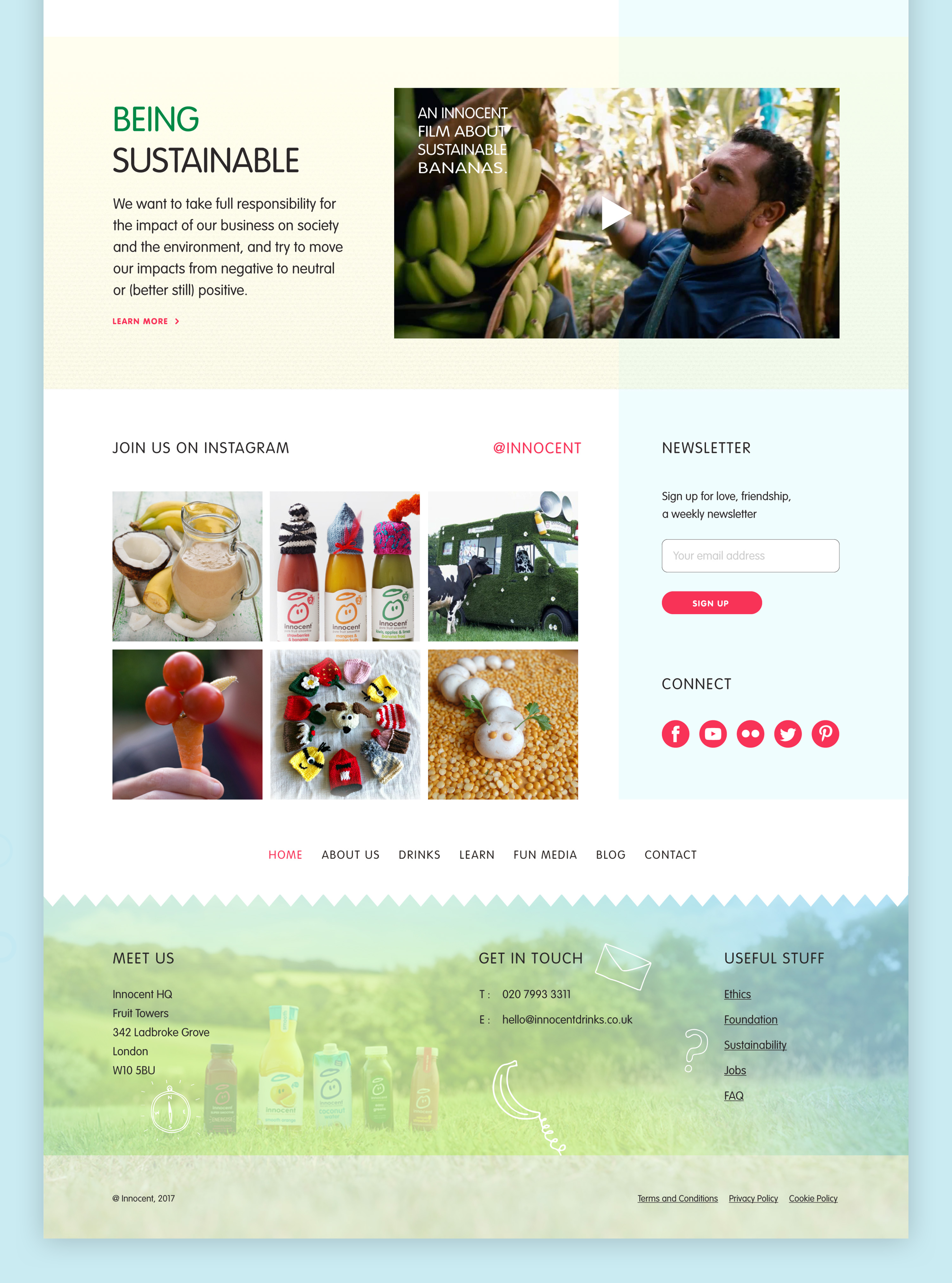
The key objectives in this project included updating the Look & Feel of the home page; organizing content in a more engaging way; demonstrating the current range of products and introducing some new ones; creating awareness about the brand values such as sustainability. Working on this project, I learned so much about grids, structure, typography, and web design in general.
The key objectives in this project included updating the Look & Feel of the home page; organizing content in a more engaging way; demonstrating the current range of products and introducing some new ones; creating awareness about the brand values such as sustainability. Working on this project, I learned so much about grids, structure, typography, and web design in general.
The key objectives in this project included updating the Look & Feel of the home page; organizing content in a more engaging way; demonstrating the current range of products and introducing some new ones; creating awareness about the brand values such as sustainability. Working on this project, I learnt so much about grids, structure, typography, and web design in general.
Home page
Home page
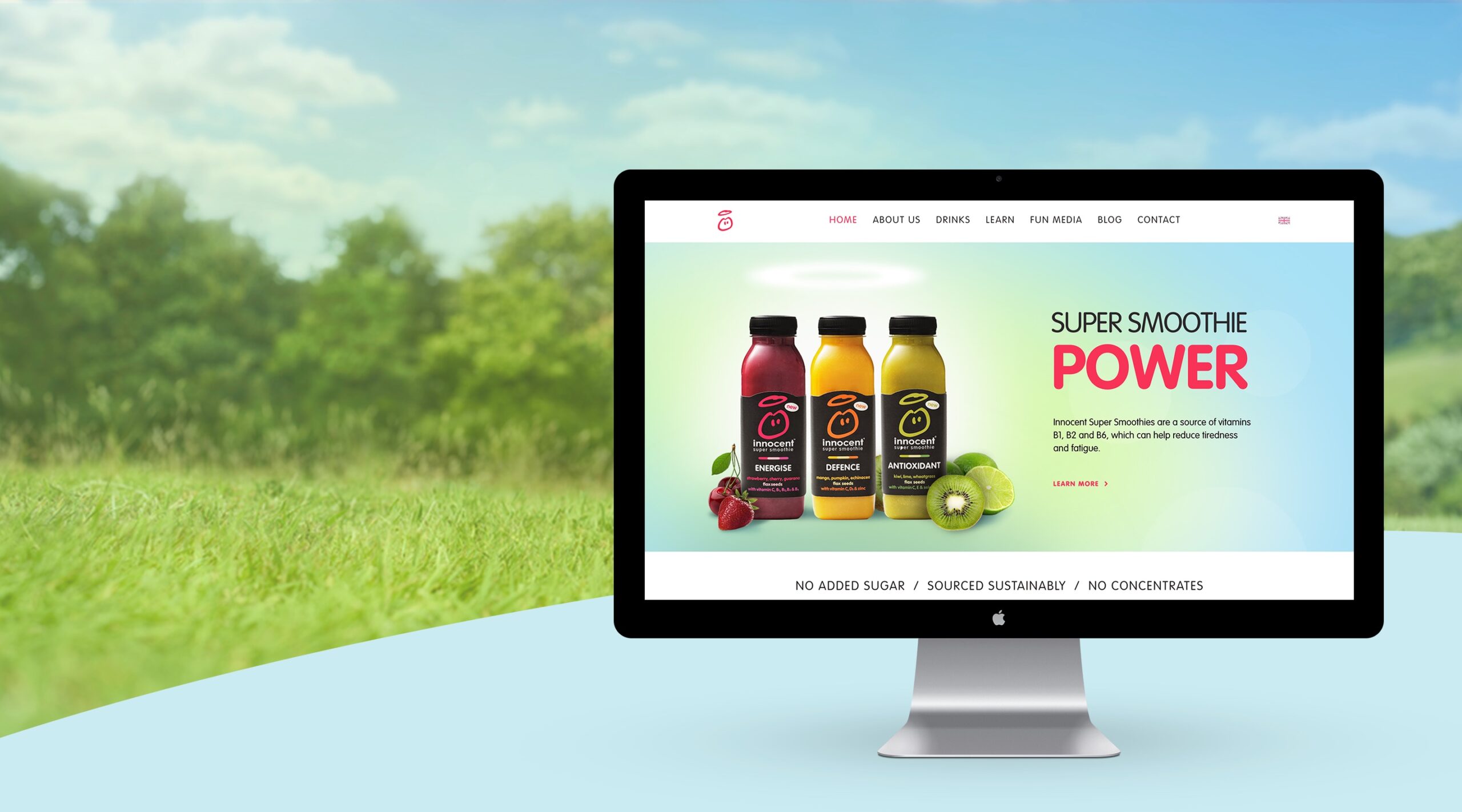
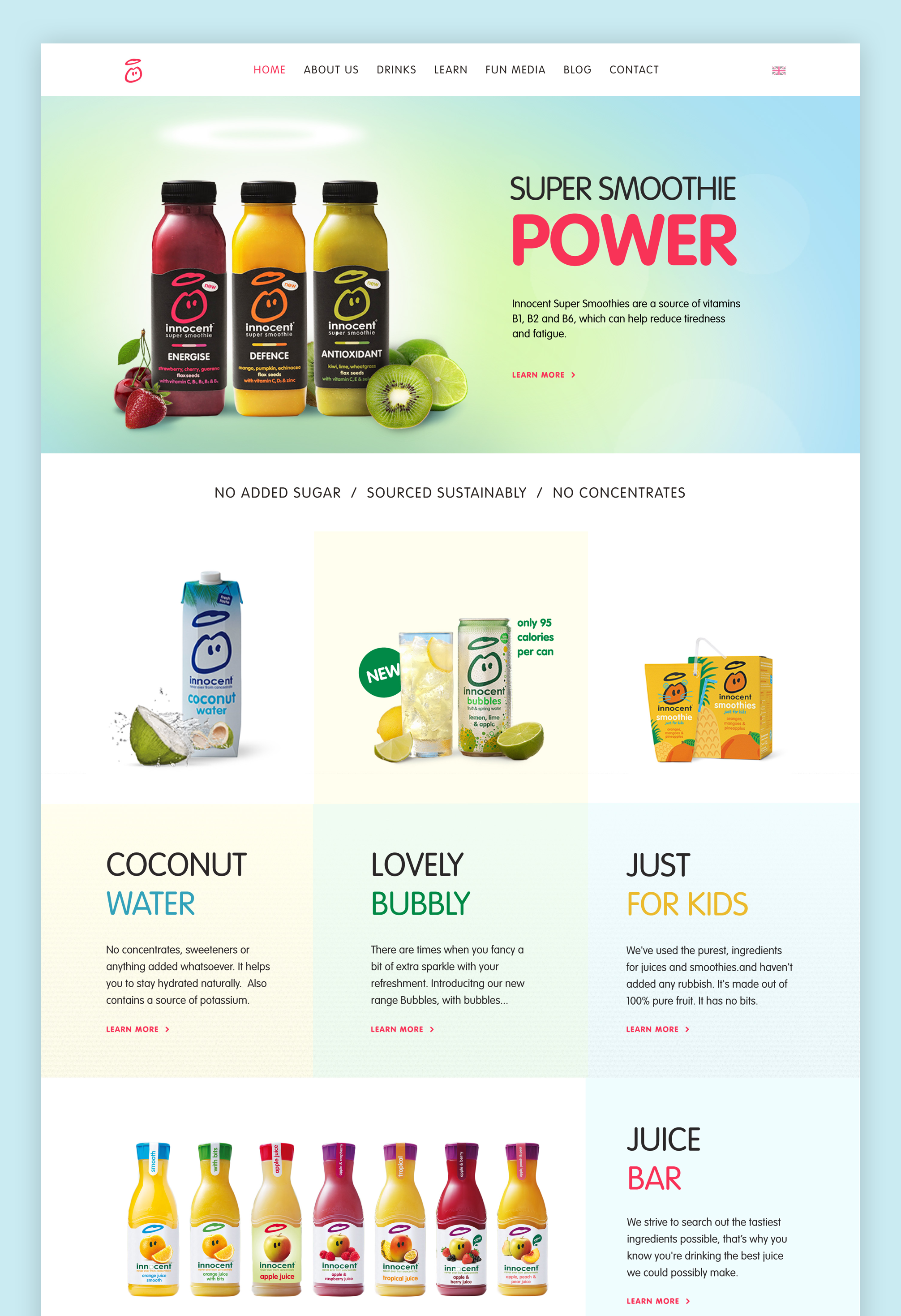
To promote the new range of smoothies and to demonstrate the naturalness of the product, I created a new hero image. The updated home page features an overview of the drinks and attracts attention to the importance of sustainability. By thoroughly reorganizing existing content and improving UX, I aimed to achieve a minimalistic and simple look and to make it easier for the user to explore the content of the website.
To promote the new range of smoothies and to demonstrate the naturalness of the product, I created a new hero image. The updated home page features an overview of the drinks and attracts attention to the importance of sustainability. By thoroughly reorganising existing content and improving UX, I aimed to achieve a minimalistic and simple look and to make it easier for the user to explore the content of the website.
To promote the new range of smoothies and to demonstrate the naturalness of the product, I created a new hero image. The updated home page features an overview of the drinks and attracts attention to the importance of sustainability. By thoroughly organising existing content and improving UX, I aimed to achive a minimalistic and simple look and to make it easier for the user to explore the content of the website.
Typography & Color
Typography & Color
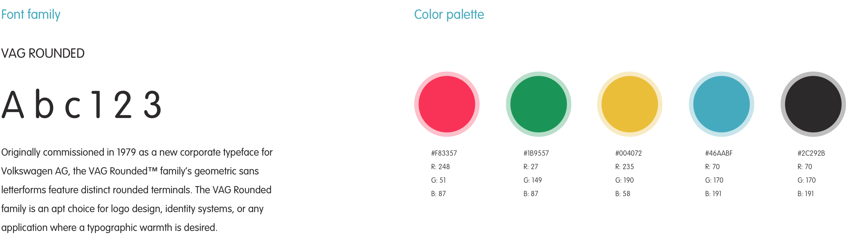
I used the Vag Rounded font family as it was used across their marketing materials but hasn't been incorporated in their digital work previously. The color palette was developed from the colors used in packaging designs and adapted for web use. The vibrancy of it was softened by using tints in the background.
I used the Vag Rounded font family as it was used across their marketing materials but hasn't been incorporated in their digital work previously. The color palette was developed from the colors used in packaging designs and adapted for web use. The vibrancy of it was softened by using tints in the background.
I used the Vag Rounded font family as it was used across their marketing materials but hasn't been incorporated in their digital work previously. The color palette was developed from the colors used in packaging designs and adapted for the web use. Vibrancy of it was softened by using tints in the background.
I used the Vag Rounded font family as it was used across their marketing materials but hasn't been incorporated in their digital work previously. The color palette was developed from the colors used in packaging designs and adapted for the web use. Vibrancy of it was softened by using tints in the background.
All rights including copyrights and trademarks belong to Innocent ltd, this was an exercise only and is not for commercial use.
All rights including copyrights and trademarks belong to Innocent ltd, this was an exercise only and is not for commercial use.
All rights including copyrights and trademarks belong to Innocent ltd, this was an exercise only and is not for commercial use.