Bunkered
UI/UX / Product design / Design System / Information Architecture / User Research
Brand: Bunkered is a UK-based golf brand with 20+ years of history, part of the DC Thomson portfolio, alongside titles like Beano, Puzzler, Stylist, and Findmypast. The brand spans a website, magazine subscription, live events, and podcasts.
Duration: Dec 2022 - Mar 2024
My role: Product Designer (UI/UX)
Team & Collaborators: Worked as the solo designer in a Product squad alongside PM, Engineers, Product Manager; collaborated with Editorial, Ad, SEO, New Product Development team
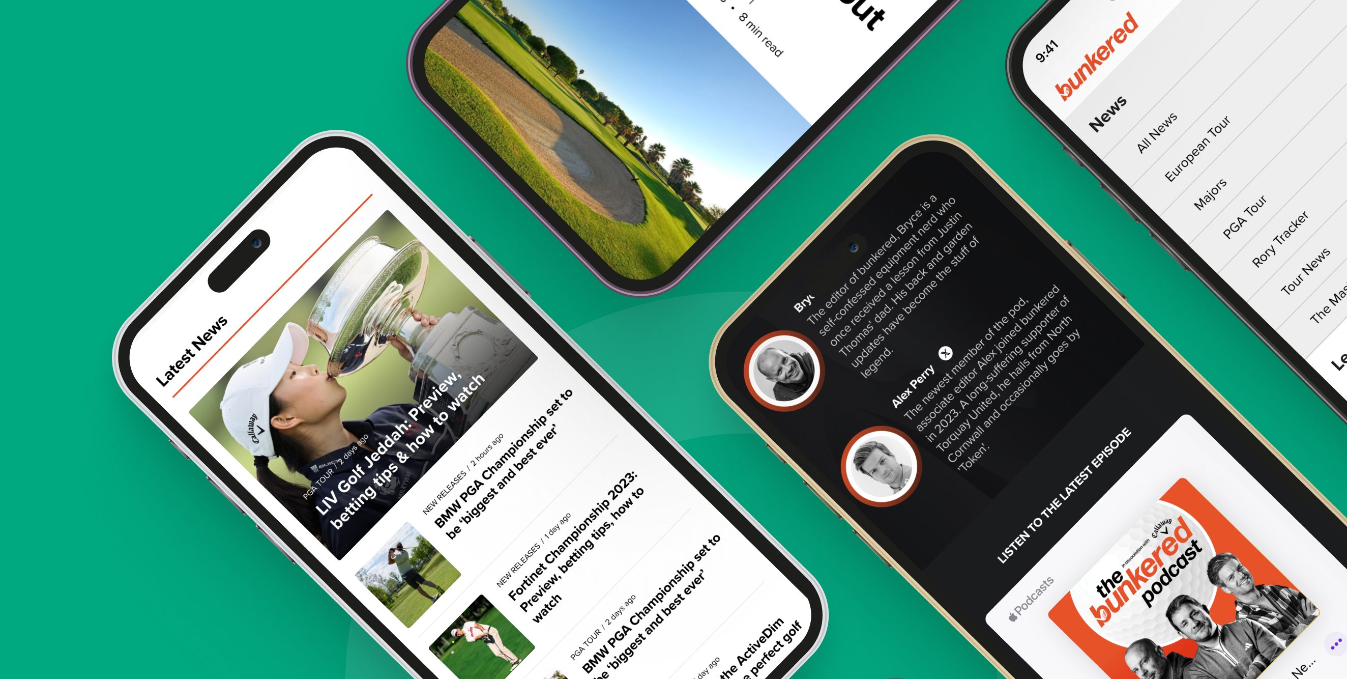
Bunkered – your home for trusted golf news, reviews, opinion, and discussion.
Bunkered – your home for trusted golf news, reviews, opinion, and discussion.
Bunkered – your home for trusted golf news, reviews, opinion, and discussion.
Bunkered – your home for trusted golf news, reviews, opinion, and discussion.
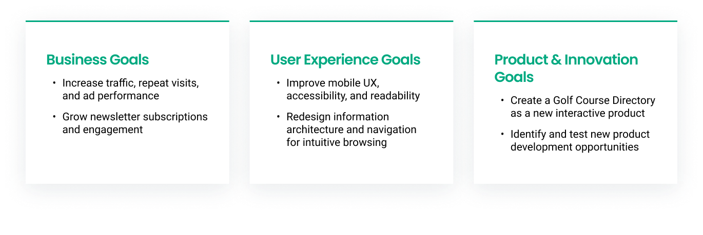
- Project Goals -
- Project Goals -
- Key Design Challenges -
- Key Design Challenges -
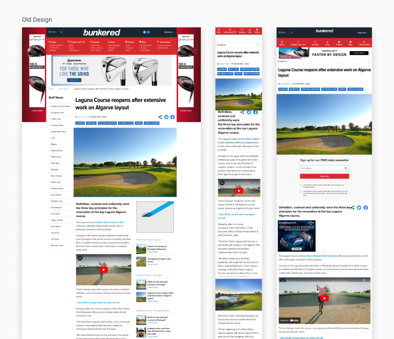
Article Template & Reading Experience
Navigation & Information Architecture
Full Website Redesign
Newsletter Experience & Sign-Ups
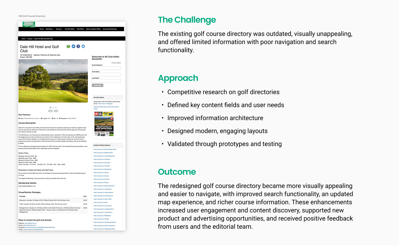
Golf Course Directory Redesign
Exploring New Product Opportunities
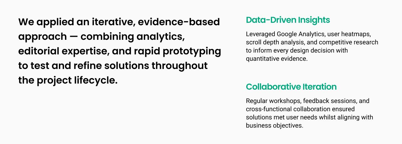
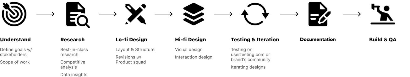
- User-centered design process -
- User-centered design process -
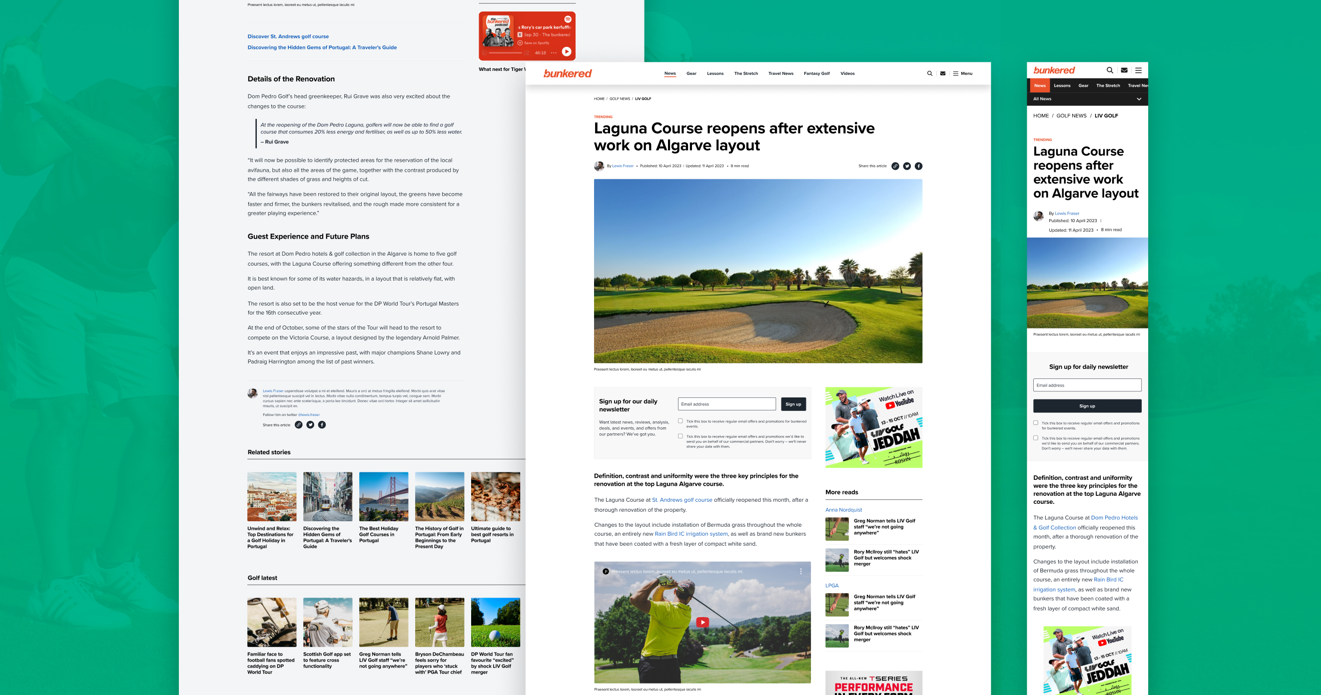
- Redesigning the Article Template -
- Redesigning the Article Template -
Challenges
- Improve layout, readability, and accessibility for a better user experience
- Optimize side panel and reduce distractions from the main article
- Streamline recommended articles to avoid overload and help users find related content
- Define visual style and UX tone for the site
Process
Rather than jumping straight into ideating concepts based on assumptions, I started by understanding the current state.
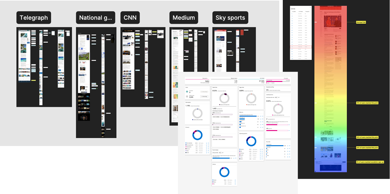
- Analysed scroll depth and user interactions via Google Analytics and Clarity
- Conducted competitive research on best-in-class sports media
- Collaborated with SEO team on optimisation best practices
- Worked with editorial to add reading time and improve article structure
- Validated through A/B testing and unmoderated user testing
Throughout the process, the focus was on the reader: making articles easy to read, navigate, and share; highlighting recommended content; and ensuring a smooth, enjoyable experience.
Research and Data Insights
To inform the redesign, I reviewed over 20 best-in-class article examples to identify layouts and features that enhance readability, navigation, and user engagement. The internal Insights team set up a custom GA dashboard for the product team and editors, which I used alongside Clarity to analyze user interactions. I examined clicks, heatmaps, page views, quality reads, and average interaction time. These insights highlighted the most engaging elements of the article layout and guided my discussions with stakeholders on the most impactful improvements.
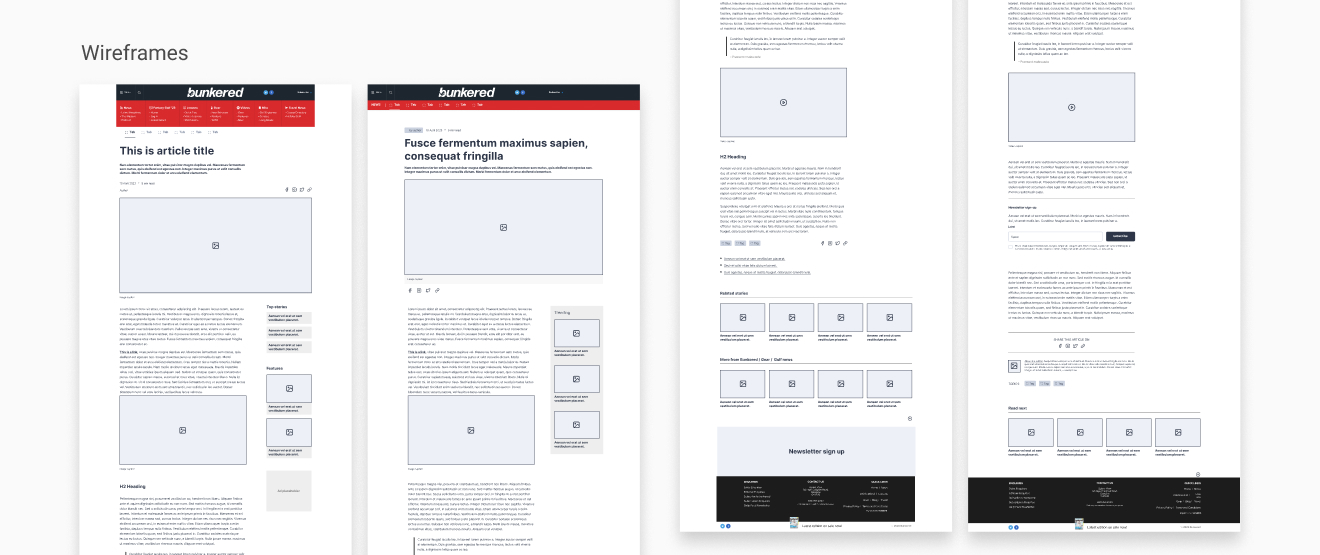
Lo-fi Design
Based on the research and data insights, I explored multiple layout options to improve key features such as newsletter subscriptions, recommended articles, podcast promotion, and sharing options. Wireframes were iterated based on stakeholder feedback to refine structure and usability.
Testing designs
Testing designs
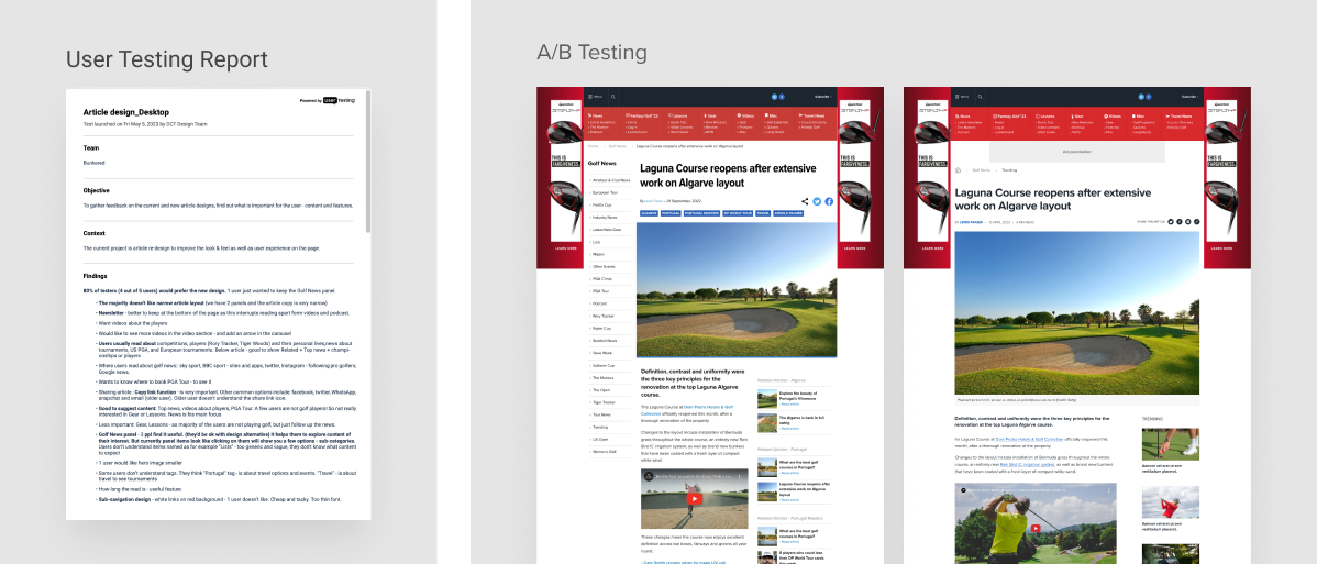
I tested the mobile and desktop designs on Usertesting.com, creating screening questions and testing scripts, and also ran A/B tests on key elements such as recommended articles and newsletter sign-ups. Findings showed that most users preferred the new layout, valued the addition of reading time, and provided feedback on recommended content, which informed further iterations.
High-Fidelity Designs and Results
The new designs removed the side panel, giving articles more space and fewer distractions. Reading time and article dates were added, and recommended articles were improved to avoid repetition. Unrelated content was cleared for a cleaner layout, while ad and newsletter placements were optimized, boosting engagement. The content hierarchy made things easier for editors and SEO. These updates also laid the groundwork for a refreshed look and feel of the website, including fonts, colors, icons, and layouts.
- Redesigning Information Architecture -
- Redesigning Information Architecture -
Problem statement
Bunkered website, created over 20 years ago, had categories largely left to editors. Over time, navigation became inconsistent, with redundant categories, making it harder for users to find content and unclear what key topics the brand should focus on.
Importance of correct IA
Good information architecture makes content easier to find and improves navigation clarity. It also strengthens SEO, supports ad revenue, aligns editorial workflows, and keeps the site consistent and professional.
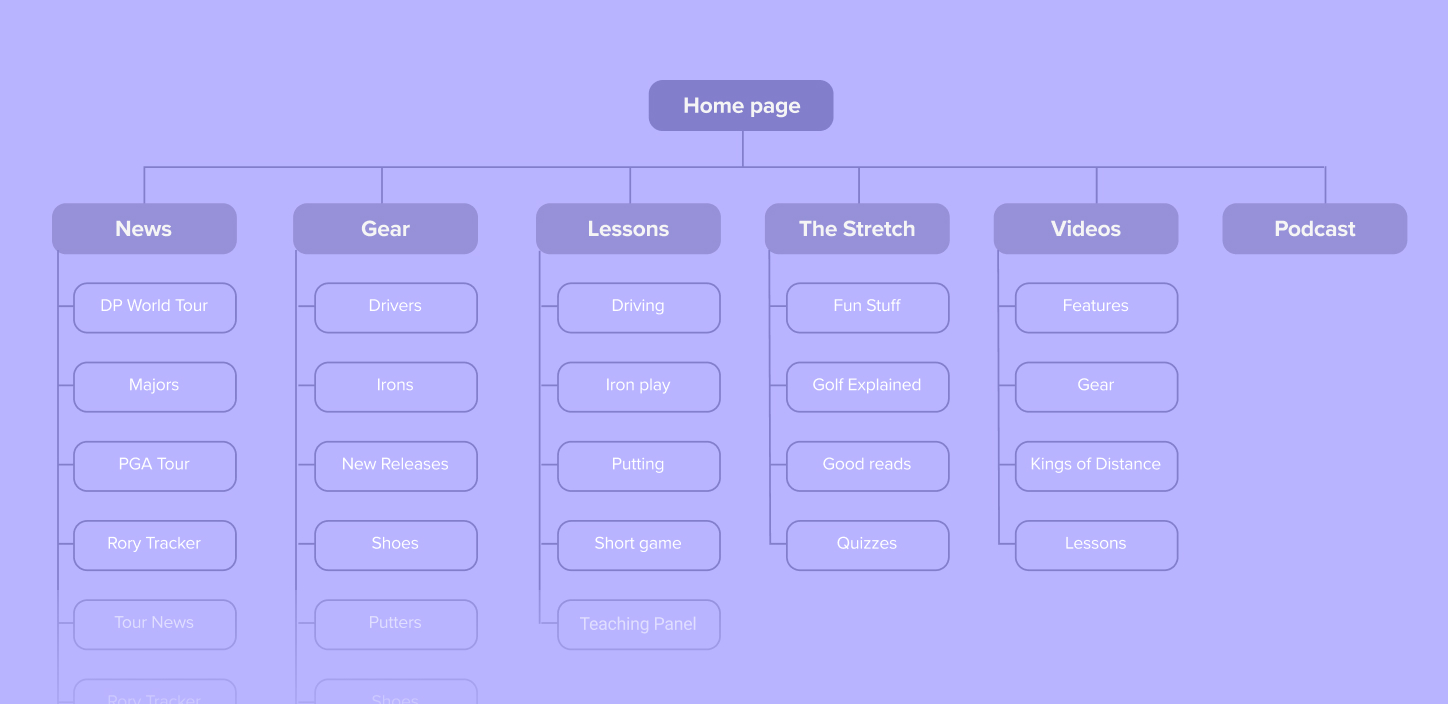
Approach
The information architecture work combined an understanding of users’ mental models, SEO insights, and editorial strategy. The process balanced user needs, search visibility, and content priorities to create a clear, agreed structure.
- Conducted keyword research using SEMRush and Google Trends to align categories with user interests and search behavior.
- Collaborated with PM, editors, SEO specialists, and engineers to define a structure that supported both editorial workflow and implementation.
- Refined content structure by removing redundancies and creating clear, SEO-informed labels.
- Conducted user testing on usertesting.com (card sorting and First Click Test) to validate navigation and naming clarity.
Result
The new information architecture organized the site, clarified navigation and menus, improved content discoverability for users, and laid the foundation for stronger SEO performance over time.
- Navigation -
- Navigation -
The website navigation was fully redesigned alongside the restructured information architecture. Key improvements included taxonomy and hierarchy, enhanced content discoverability, and alignment with business goals, all guided by data insights.
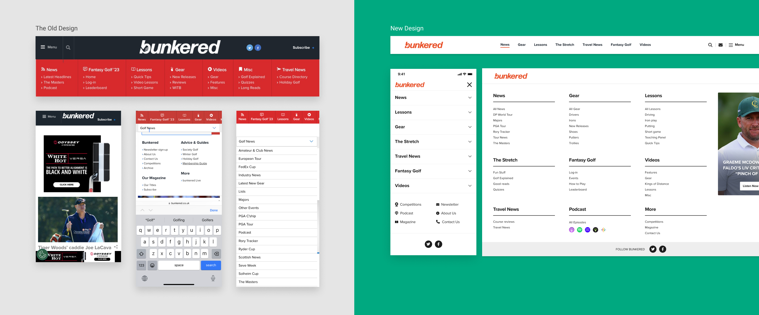
- Full Website Redesign -
- Full Website Redesign -
I led a complete redesign of Bunkered, covering all pages of the website. The site previously lacked a design system and had inconsistent visuals compared to other brand touchpoints like the magazine and ads. I refreshed the visual style to add energy, clarity, and simplicity while keeping the experience familiar for readers. A clean black-and-white foundation with orange accents, updated typography (Proxima Nova), and improved color contrast created a modern, accessible design that highlights content without distraction and improves consistency across the website.
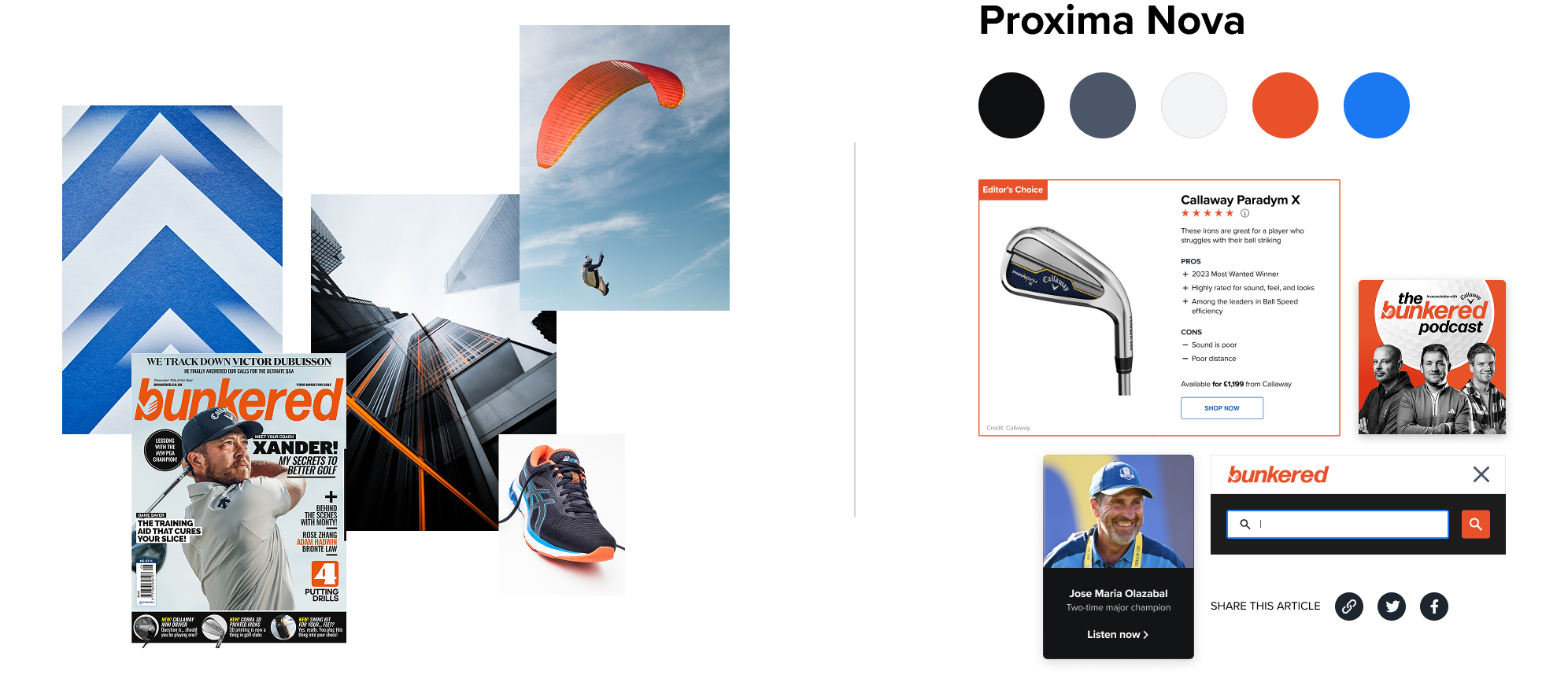
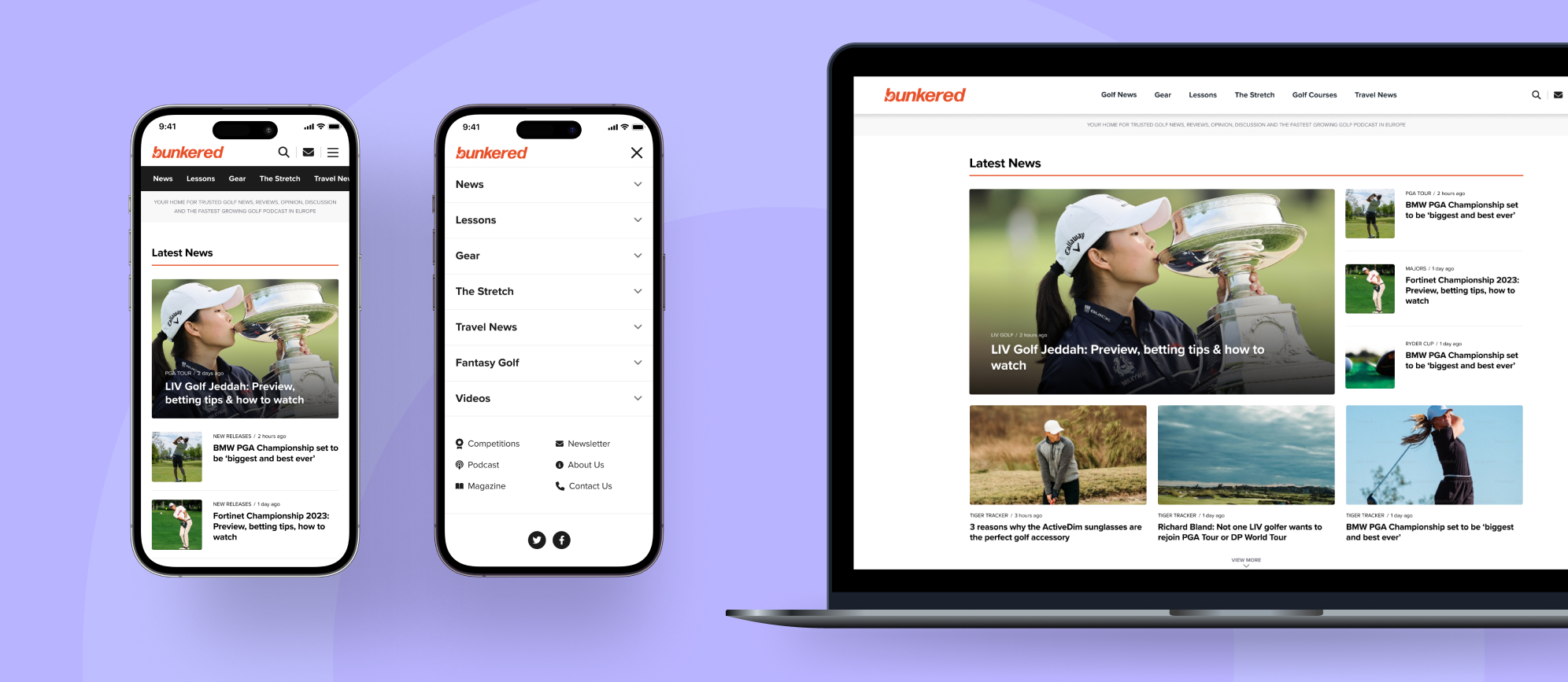
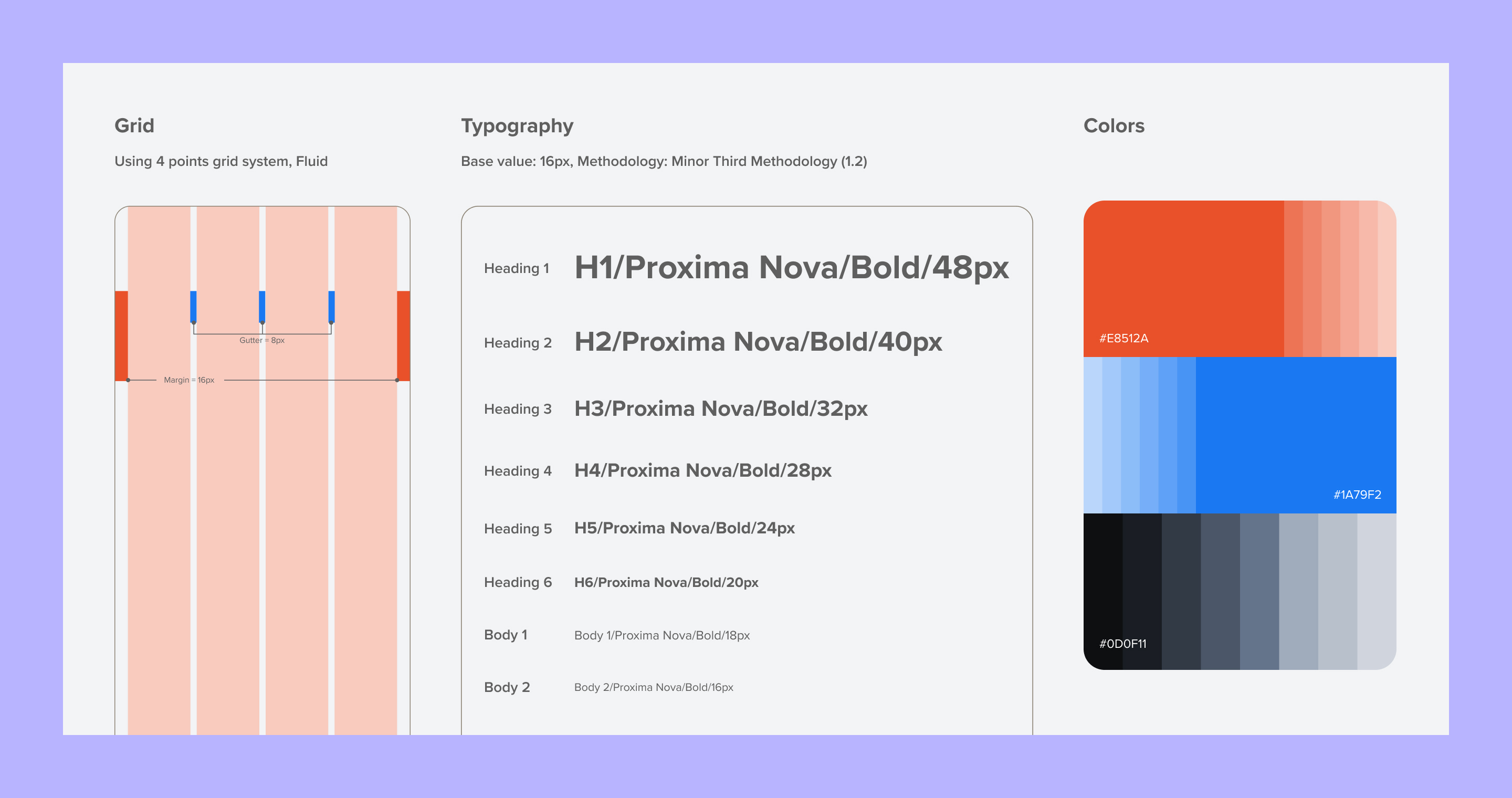
Design system
The website initially had no design system, and existing components were not visually consistent or reusable. As I designed new pages, I first created a UI kit, which evolved into a practical design system over time. It included core components, typography, colors, and key templates, providing a foundation for consistent, clear, and accessible design across the website.
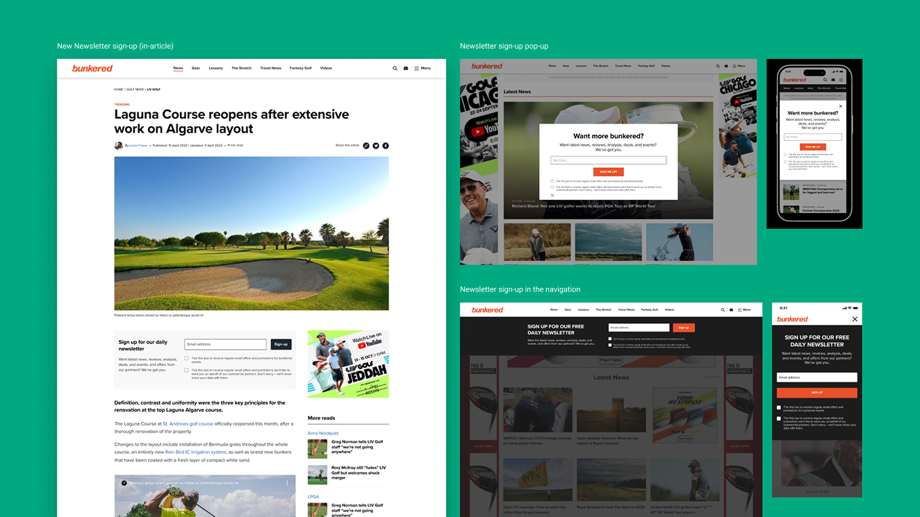
- Newsletter Experience & Sign-Ups -
- Newsletter Experience & Sign-Ups -
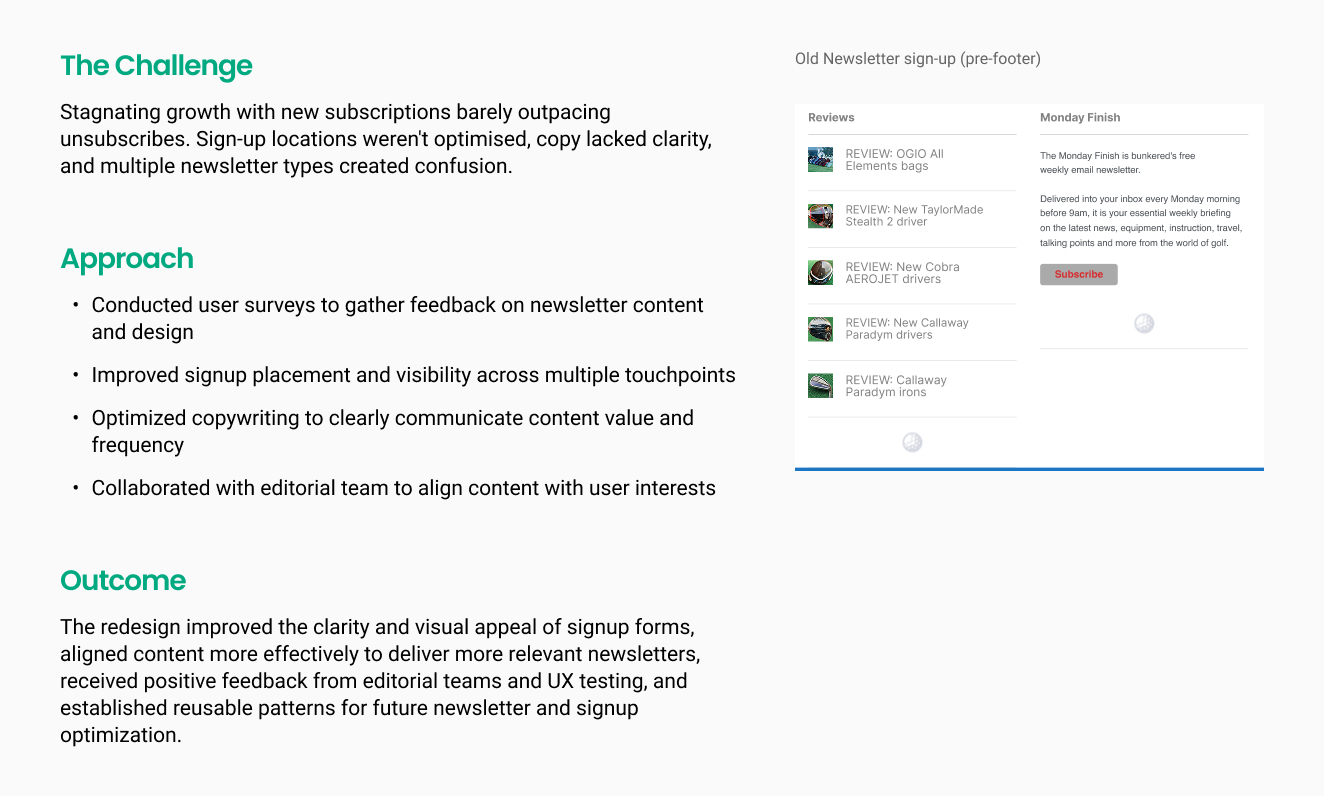
I designed and tested multiple newsletter signup variations to identify the most effective approach, measuring user engagement and conversion.
- Golf Course Directory Redesign -
- Golf Course Directory Redesign -
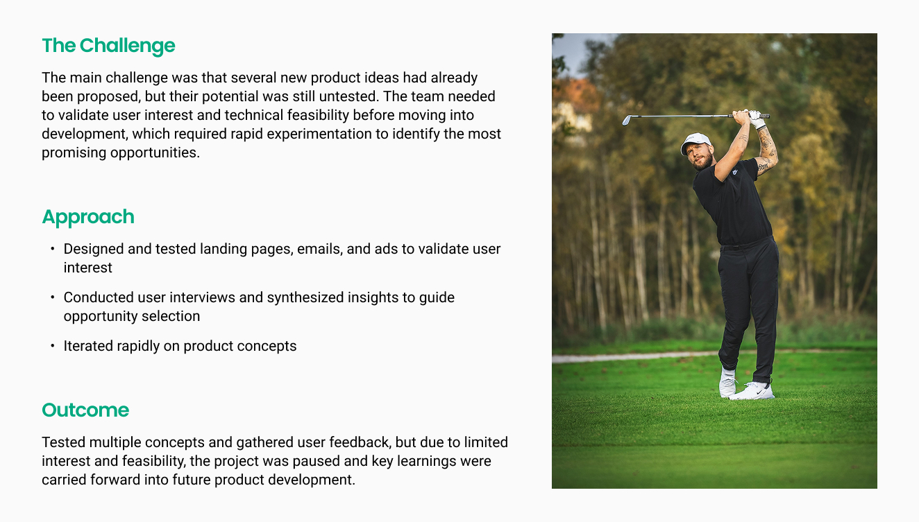
- New Product Discovery -
- New Product Discovery -
I participated in the Experimental phase to validate assumptions and potential solutions for Bunkered before company investment. This included designing and testing concepts, rapid prototyping, and opportunity mapping, "How Might We” exercises. I also contributed to NPD workshops for other brands.
- Project Outcomes -
- Project Outcomes -
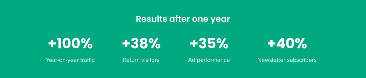
Overall Impact: the redesigned golf news experience exceeded expectations in its first year, improving usability, visual appeal, and engagement across multiple touch points. Traffic doubled, return visits and newsletter sign-ups increased, and the project laid the foundation for future product and growth opportunities.
- Reflection -
- Reflection -
Starting with the core
With a project of this scope, it was essential to prioritize where to start. Focusing on the article template first made sense, as it represents the majority of the website’s content and sets the tone for the rest of the design. The homepage redesign followed, once the information architecture and content strategy were clarified.
Collaboration is key
Working closely with stakeholders, the SEO and insights teams, and my product squad was essential. Regular retros and early feedback on wireframes helped the process move more efficiently and kept everyone aligned.
The voice of the user matters
User testing proved to be invaluable – it revealed issues stakeholders couldn’t catch and ensured the designs remained truly user-centered. I wish user feedback could be continuously integrated to keep improving the designs over time.