Mental Health Platform
Branding / Presentation
Overview
Mental health platform was created to assist businesses and people in their journey towards better mental health. By treating organizational productivity and effectiveness as products of an individual's wellbeing, it empowers individuals to speak up and organizations to listen. Currently, it’s a startup seeking investment to design, build and develop the platform.
Mental health platform was created to assist businesses and people in their journey towards better mental health. By treating organizational productivity and effectiveness as products of an individual's wellbeing, it empowers individuals to speak up and organizations to listen. Currently, it’s a startup seeking investment to design, build and develop the platform.
Mental health platform was created to assist businesses and people in their journey towards better mental health. By treating organizational productivity and effectiveness as products of an individual's wellbeing, it empowers individuals to speak up and organizations to listen. Currently, it’s a startup seeking investment to design, build and develop the platform.
Details
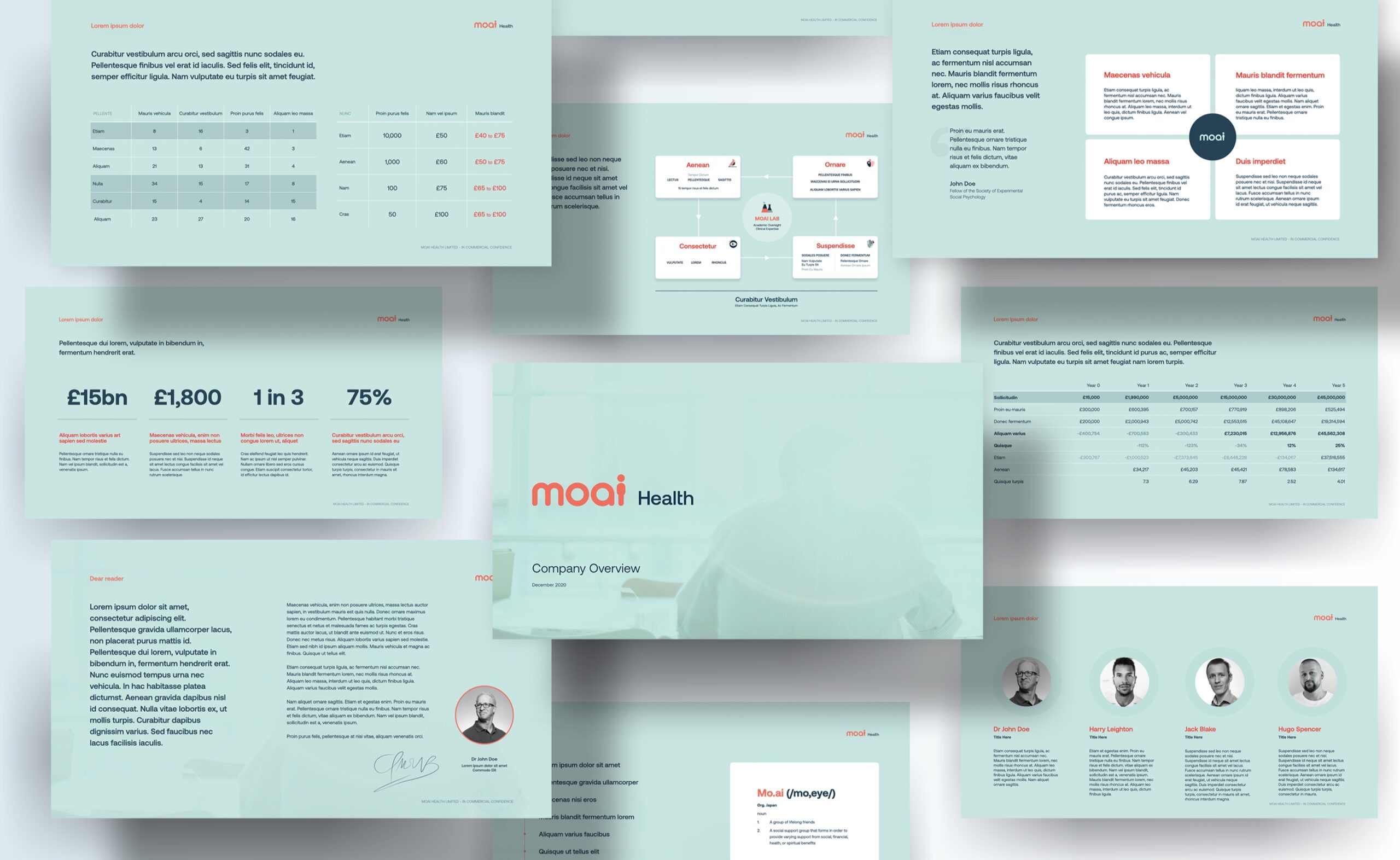
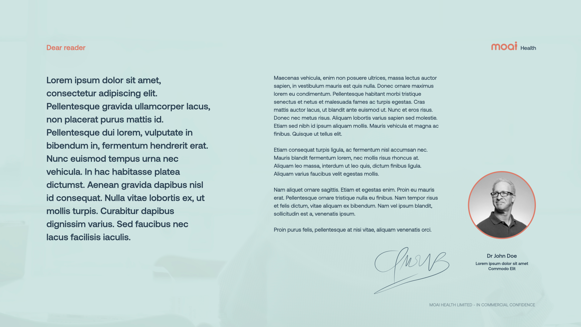
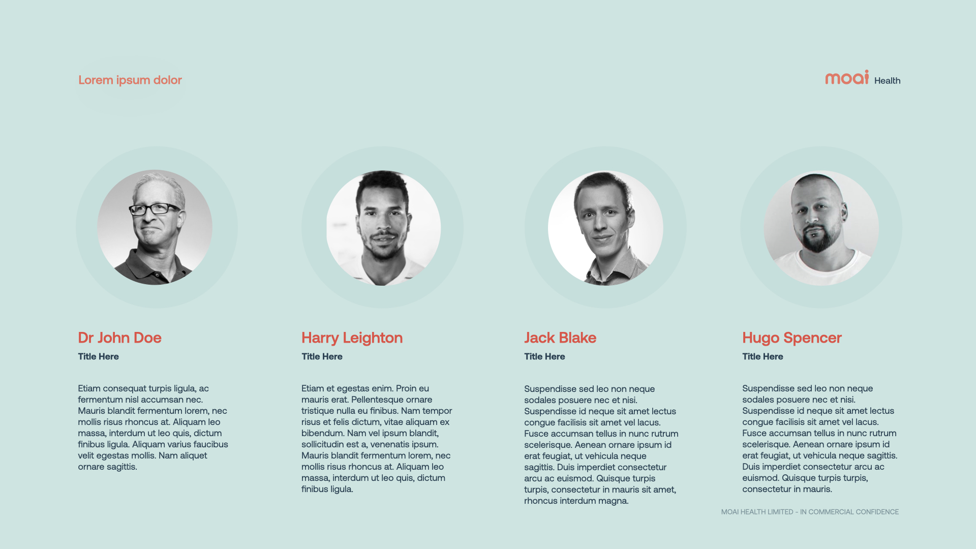
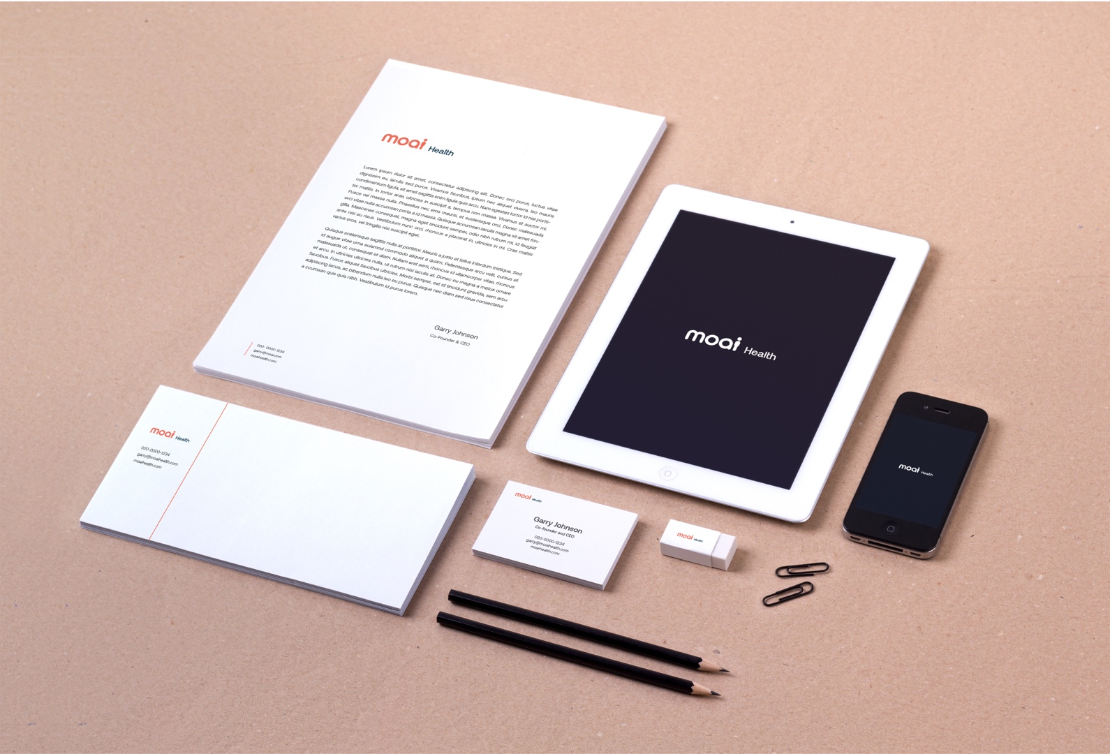
My role was to define brand identity and support in developing an investment pitch deck. The essence of their identity is expressed within the logo, allowing it to function as a graphical device across various media. The identity was further expressed in typography, color palette, and visual language.
My role was to define brand identity and support in developing an investment pitch deck. The essence of their identity is expressed within the logo, allowing it to function as a graphical device across various media. The identity was further expressed in typography, color palette, and visual language.
My role was to define brand identity and support in developing an investment pitch deck. The essence of their identity is expressed within the logo, allowing it to function as a graphical device across various media. The identity was further expressed in typography, color palette, and visual language.


Branding
Branding
Branding
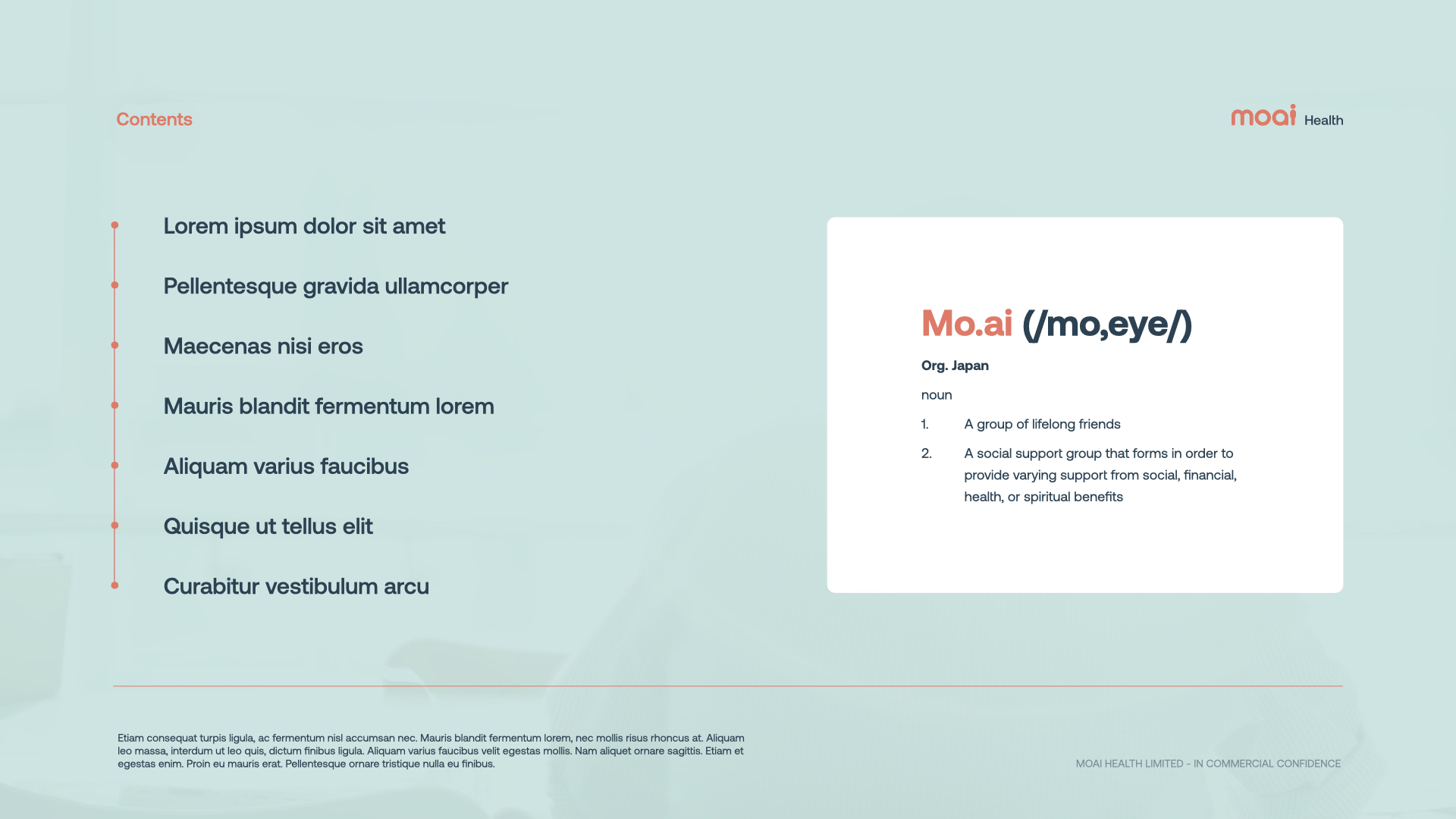
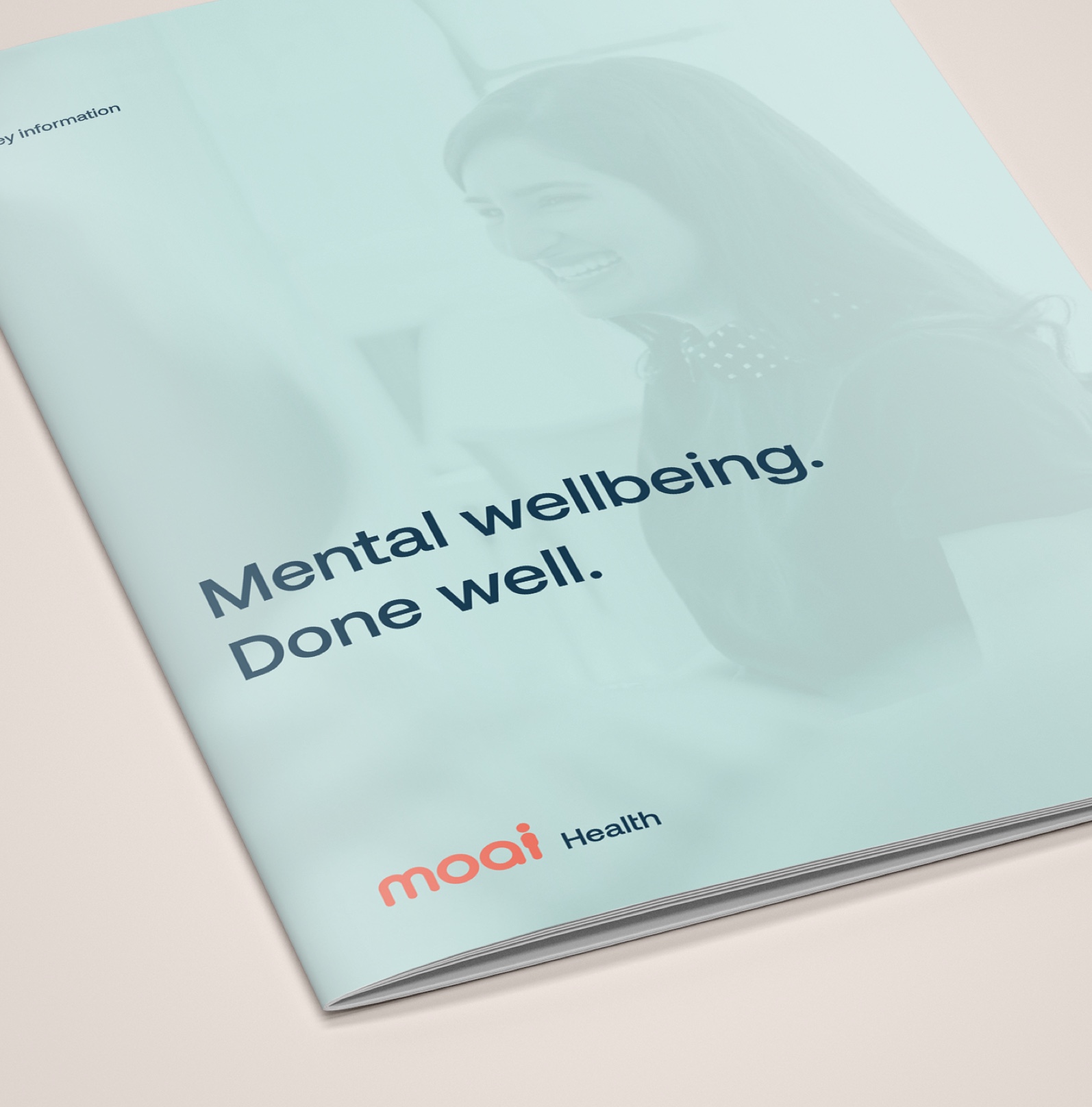
The logo takes inspiration from the name itself – in Japanese it means: 1– a group of lifelong friends; 2 – a social support group that forms in order to provide varying support for social, financial, health, or spiritual benefits. To emphasize the compassionate spirit and human connection embodied by the product, this was echoed in the form of language.
The logo takes inspiration from the name itself – in Japanese it means: 1– a group of lifelong friends; 2 – a social support group that forms in order to provide varying support for social, financial, health, or spiritual benefits. To emphasize the compassionate spirit and human connection embodied by the product, this was echoed in the form of language.
The logo takes inspiration from the name itself – in Japanese it means: 1– a group of lifelong friends; 2 – a social support group that forms in order to provide varying support for social, financial, health, or spiritual benefits. To emphasise the compassionate spirit and human connection embodied by the product, this was echoed in the form language.
Colors & Typography
Colors & Typography
Colors & Typography
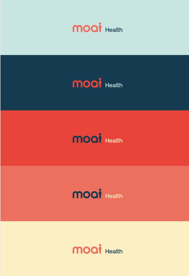
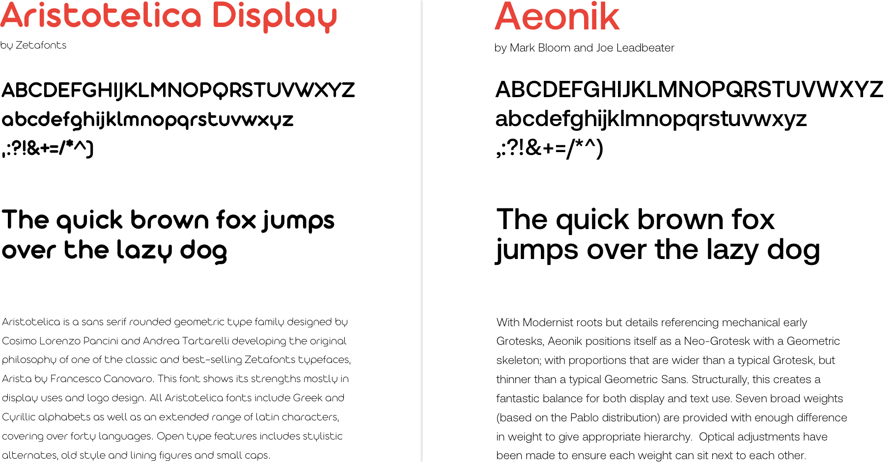
With a foundation in mellow tones, originating from the client's custom-made illustrations, it was developed towards a sharper, more contrasted palette. It is expressing the brand values of compassion, humanity, and trust. Aristotelica Display was used to create the logo. It was paired with another Sans Serif – Aeonik – striking a balance between simple & clean and soft & approachable.
With a foundation in mellow tones, originating from the client's custom-made illustrations, it was developed towards a sharper, more contrasted palette. It is expressing the brand values of compassion, humanity, and trust. Aristotelica Display was used to create the logo. It was paired with another Sans Serif – Aeonik – striking a balance between simple & clean and soft & approachable.
Presentation Design
Presentation design
Presentation design